
UX DESIGN
Alma Case Study
On the surface Alma is an app that connects people to essential resources near them, but more so it’s a way to nourish community. The app is designed for those in need to search for essential resources (food banks, shelters, donation drives, etc), show volunteers opportunities around them, and allows organizations to poll their community about what they really need.
ROLE/RESPONIBILITIES
My role was bringing the app from concept to design. Responsibilities included user research, wireframing, and designing prototypes.
CHALLENGE/PROBLEM
Accessing food banks and other community resources can be challenging for individuals in need due to limited information, lack of awareness, and inefficient coordination between service providers and beneficiaries. This leads to a significant gap in connecting those in need with the available resources, resulting in food insecurity and inadequate utilization of community support systems.
GOALS/OBJECTIVE
The objective of the app is to create a user-friendly platform that efficiently connects individuals in need with local food banks and other community resources, ensuring equitable access to essential services. The app aims to streamline the process of finding and accessing these resources by providing up-to-date information, facilitating communication between service providers and users, and promoting effective coordination among stakeholders. The ultimate goal is to alleviate food insecurity and empower communities by fostering stronger connections and utilization of available resources.
TARGET AUDIENCE
Ages 16 to 65, people that utilize government assistance programs (SNAP/EBT/Cash Assistance, etc).


The name "Alma" carries layers of meaning. Drawing inspiration from various languages, each contributing to the overall essence of the app. In Spanish, "Alma" translates to "soul," reflecting the intention to connect with users on a deeper, more personal level. In Arabic, Alma is a feminine name, meaning "apple," symbolizing growth, knowledge, and nourishment; essential sustenance for its users. Additionally, in Latin, "Alma" translates to "nourishing," emphasizing the app's commitment to fostering personal development and well-being.
Furthermore, the similarity to the English word "alms" within the name evokes the concept of donations and charity, highlighting the app's focus on giving back and supporting causes. Finally, the euphonic nature of the name, devoid of hard consonant sounds, imbues it with warmth and softness, creating an inviting and comforting impression for users.
The Name, Alma

The Logo
The design of the logo is tied to Alma’s purpose of connecting people in need to local resources within their community. The spouting plant represents the nourishment and growth that individuals can experience through accessing the resources available to them. It signifies the transformative power of support and assistance.
The north star symbol encapsulated within the plant embodies the guidance and hope that the app provides to users as they navigate their challenges. It serves as a beacon, helping them find their way towards the right resources and support systems.
The radiating lines surrounding the north star represent the communication and spread of ideas, reflecting the app's role in connecting individuals to a network of resources, organizations, and community members. This imagery symbolizes the app's ability to facilitate information-sharing and collaboration, enabling users to access the help they need.
The elegant yet approachable serif font further emphasizes the app's mission of fostering meaningful connections and providing a user-friendly experience. Overall, the logo effectively communicates the app's purpose of connecting people in need to the resources available in their community, while also evoking a sense of hope, growth, and interconnectedness.

Initial Sketches
The initial ideation process consisted of quickly section some features and very rough layouts on the screen. Special attention was given to place the search bar up top to give it some hierarchical importance. Also different dashboards were created depending on different types of users (members vs. volunteers vs organizations).

Wireframing
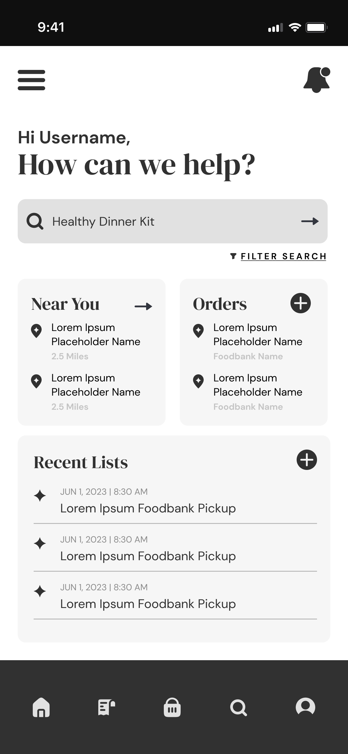
After creating initial sketches for the app, I began refining the features to develop a rough layout. I used Figma to translate my sketches into digital wireframes, ensuring that the basic structure and functionality of the app were represented accurately. These wireframes provided a visual framework for the different screens and interactions within the app, allowing me to assess the flow and usability of the interface.
To prepare for usability testing I added interactions and basic, animated transition between frames. The user flow shown here takes you from a member dashboard through the steps of searching for an item near you, picking a local food bank, adding items to an order and ends at a confirmation screen.

Usability Study
After the prototype link was reviewed, a usability test was conducted to determine if this app is wanted by users and if it is beneficial. Also we aim to see if the main user flow is easy to complete. An unmoderated usability study was conducted where participants were observed (remotely) completing tasks on the prototype and then answered follow-up questions. Results were a mix of quantative measurements (time completing a task) and qualitative measurements (rating and giving verbal feedback on each step).
After organizing the data into patterns/themes the following insights were evident:
Confusion
Users were confused at what to enter on prompts implying input fields could be labeled better.
01
Navigation
Many users couldn’t recognize what was navigation and would be benefited by better cues on what is clickable.
02
Hierarchy
There were some cases when users didn’t know where to the start, meaning that better hierarchy could be implemented to guide users where to go first.
03
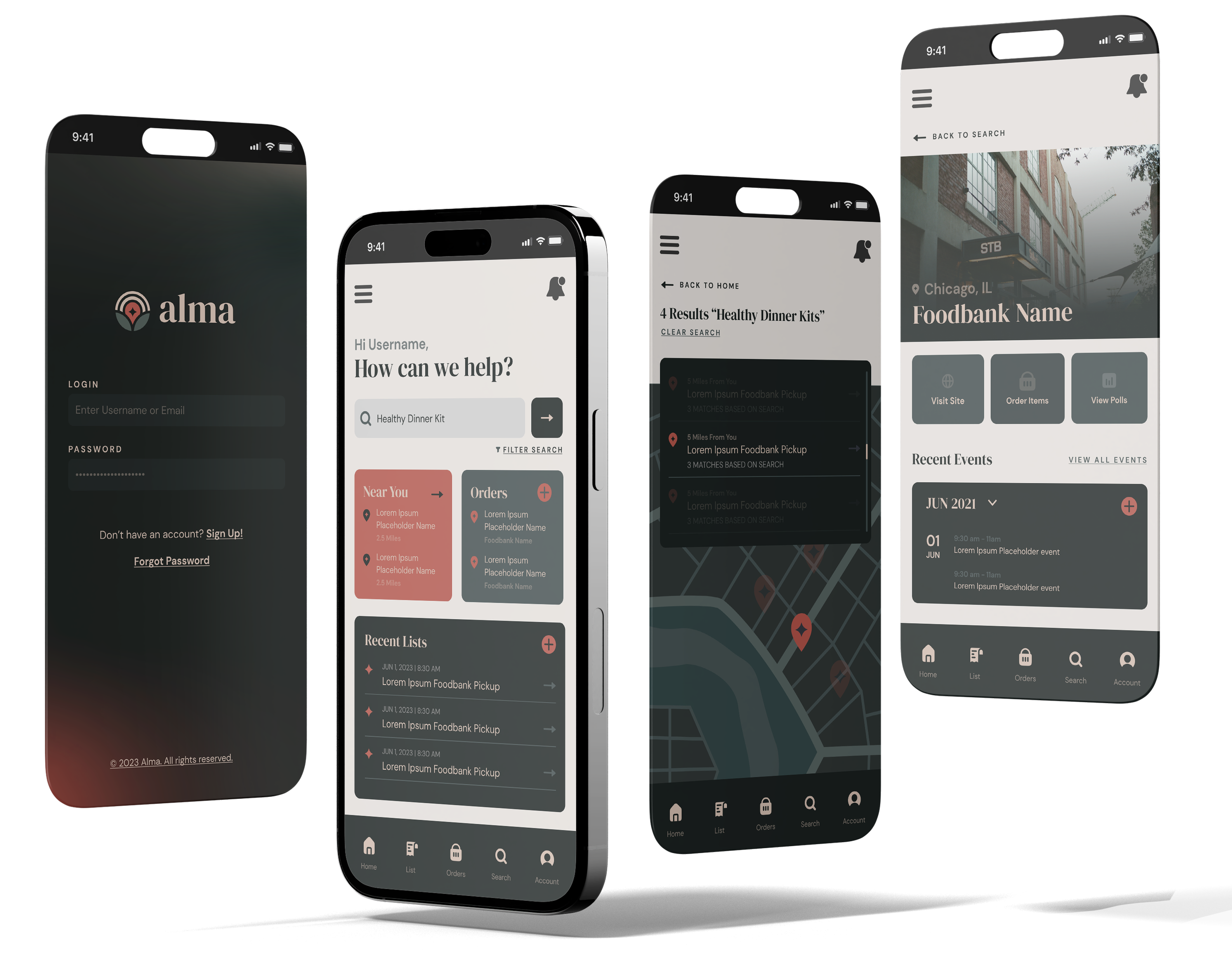
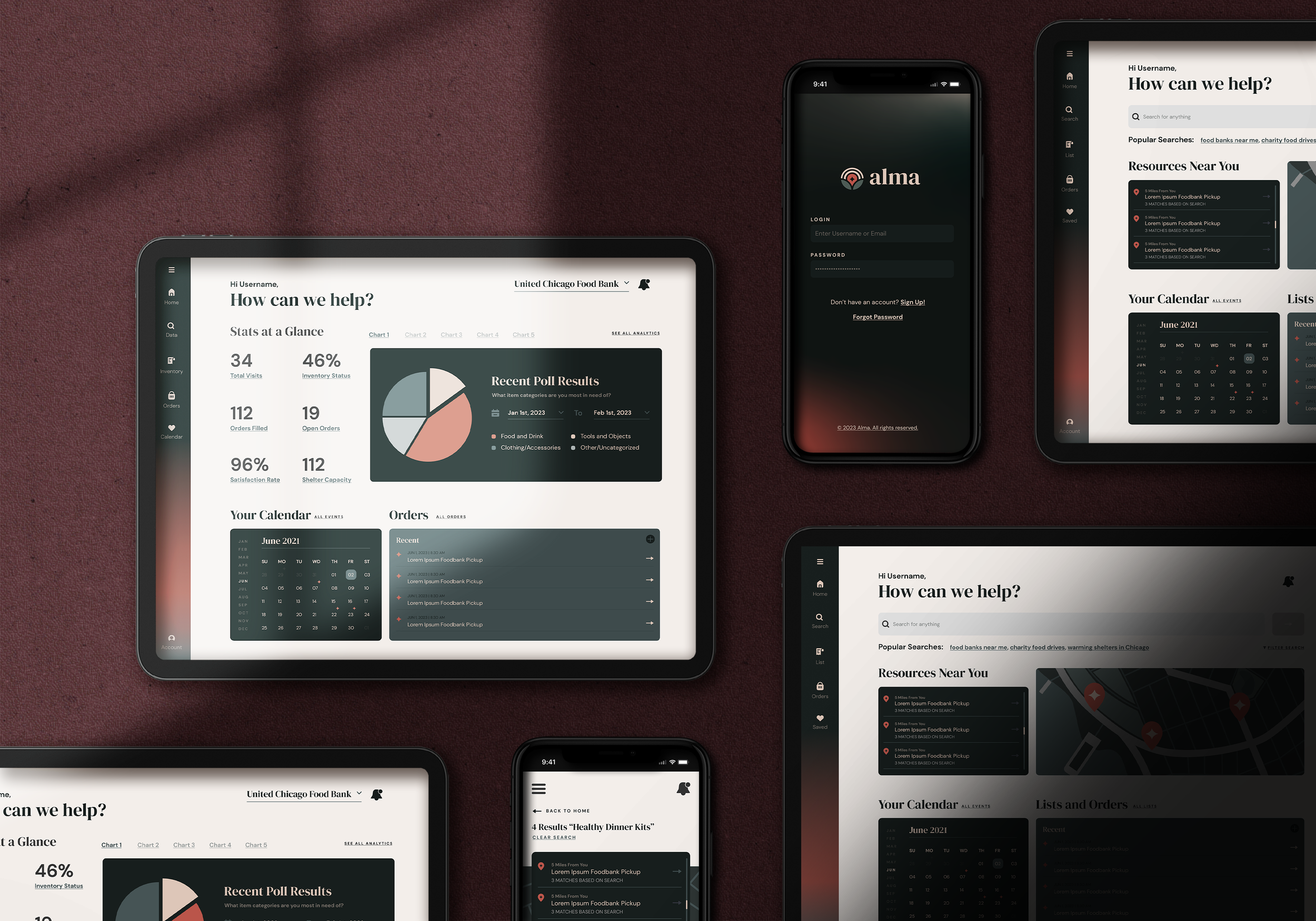
Hi-Fidelity Mockups
After refining the mockups, additional animated transitions and interactions were added to the prototype to ehance the userflow from dashboard to order confirmation. Additional screens were added outside of the main userflow that showcased other dashboards and a desktop version of the app.
Conclusion
Accessibilty Considerations
Though not visually evident, during functional implementation and buildout, special note would be taken to allow for the use of screen readers, text to speech and other input methods, and support of multiple languages.
Limitations and Next Steps
The app would require an extensive inventory management system to be maintained by partner organizations. In addition, adoption by partner organizations and users would be required to build a network.
The next step would be doing more user research and design refinement on specific areas of the app. Also additional case studies must be built to showcase the apps capabilites and urge adoption.
What I learned
I gained a deep understanding of the importance of user-centric design, realizing that empathizing with the needs and challenges of the target audience is crucial for creating a meaningful and effective solution. Additionally, I learned the significance of creating a cohesive design system and maintaining brand consistency to ensure scalability and a seamless user experience as the app evolves.
