
UX DESIGN
Jupiter Jazz, Case Study
Jupiter Jazz is a music venue and cocktail bar that hosts intimate performances in a warm atmosphere. The venue offers a curated menu of light fare and a variety of wine, beer, and spirits. The shows are the primary draw for the target audience of 25-60 year olds fans of jazz, blues, and upcoming artists of any musical genre. Jupiter Jazz aims to provide both artists and patrons with a space to enjoy new music, food, and cocktails in a cozy setting.
ROLE/RESPONIBILITIES
My role was bringing the app from concept to design. Responsibilities included user research, wireframing, and designing prototypes.
CHALLENGE/PROBLEM
Most musical venues have a cluttered calendar often times with a lot
of irrelevant info, a clunky ticket ordering system, and a checkout process that does not show additional fees until the end.
GOALS/OBJECTIVE
Design a website that easily displays upcoming and featured shows,
a navigate-able ticket system, and a checkout process that features transparent pricing.
TARGET AUDIENCE
Ages 21 to 60, people local to the area, people with disposable income.


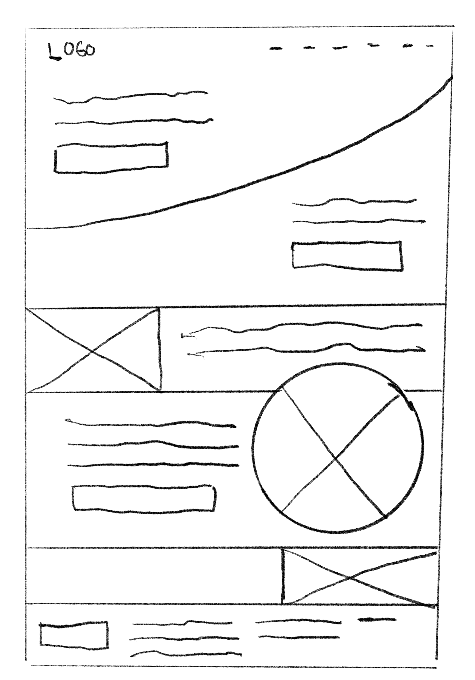
Paper Wireframes
A variety of layout options were sketched all features different hero modules. The chosen layout was picked as it has a grid of easily customizable links to the most used parts of the website offering easy navigation. Also the featured hero section has space for a primary CTA allowing for easy site conversion right above the fold.


Wireframing
Initial wireframe design based were created based on a combination of initial research feedback and the paper wireframes.
The low-fidelity prototype connected the primary user flow of booking a ticket to a show so the prototype could be used in a usability study with users.

Usability Study
A usability study was conducted to figure out how long it took to book a ticket and get to the checkout screen. In addition, the study asked users how they felt about each step of the process and the app experience over. The study would help guide the wireframe phase to the mockup design.
The goal of the study was to see how users felt about the ticket ordering process and if they felt the site was navigable. This was measured qualitatively by a questionnaire and quantitatevly by measure the amout of time on the task.
The method used was an unmoderated study where participants were assigned a series of tasks that lead them through the process of booking a ticket. After each question the participant would be asked how they felt about the process.
After organizing the data into patterns/themes the following insights were evident:
01
CTA PROMINENCE
Several participants noted that the CTA that guided them through the process were glossed over in the layout.
02
Panel-Grid
4/5 the participates noted that they weren’t sure what the the grid was there for. They were unless where each category was leading. This was mainly a language issue that could be addressed with actual content rather than filler copy.


Hi-fidelity Design
Taking feedback from the usability study, the wireframes were modified by making the major CTA’s stand out with the distinct accent color and populating the grid area with more content, imagery, and specific language.
The high-fidelity prototype extends the app experience from the lo-fi version buy adding a imagery and content that ends the user journey at the order confirmation page.

Conclusion
Accessibilty Considerations
Although some screens don’t show the full functionality that is planned for the app, a number of considerations were taken to make the app more accessible to people with communication, physical, visual, and auditory difficulties. Here are some features of note: as this was a darker color palette, specific attention was given to the contrast of text, background, and imagery to ensure the design passed Web AIM’s contrast checking score. Each section heading had a visual label above it to both help organize the info, but also aids those who use screen readersby quickly locating specific sections.
Key Takeaways and Next Steps
Designer biases are easier to overlook. One should not assume user will know common gestures and buttons so clear CTA’s and language is integral to a worthwhile user experience.
The next steps would be to conduct another round of usability studies that focus on other app functionality (shop and e-commerce, account features, etc). In addition, conduct user research on new areas of need.
