UX DESIGN
Sable Rose, Case Study
Sable Rose is a florist and bar that sells flowers, gifts, and serves alcohol. They have a central location in a busy city center. Alongside serving walk-in customers, Sable Rose targets users that might not have time to travel to a florist to buy a gift by offering a country-wide delivery service for their extensive catalogue of products.
ROLE/RESPONIBILITIES
My role was bringing the app from concept to design. Responsibilities included user research, wireframing, and designing prototypes.
CHALLENGE/PROBLEM
Customers often don’t have time to travel to a brick and mortar shop to get gifts/flowers and then delivery it to a recipient.
GOALS/OBJECTIVE
Design an app for Sable Rose that allows customers to browse their catalogue easily and order items for pick and delivery.
TARGET AUDIENCE
Ages 16 to 65, people that routinely use delivery apps and e-commerce sites, and people both local and far from the florist shop.

Initial Sketches
Taking the time to draft iterations of each screen of the app on paper ensured that the elements that made it to digital wireframes would be well-suited to address user pain points. For the home screen, I prioritized having quick ways to search and order products to save time.

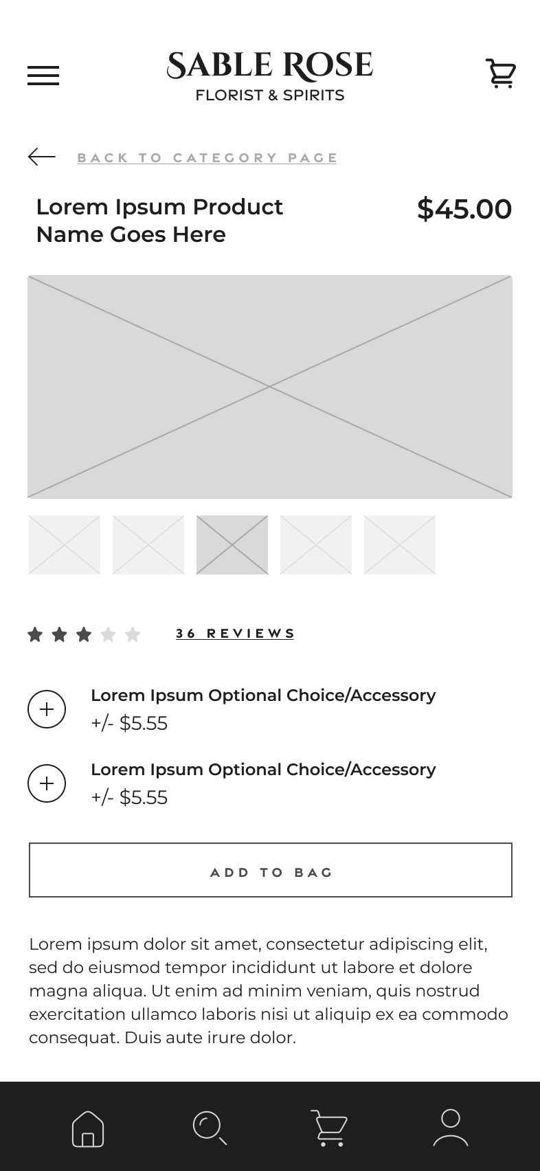
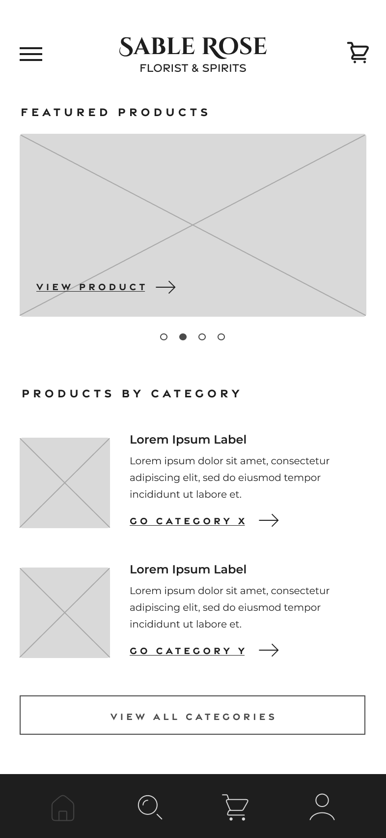

Wireframing
I made sure to base screen design on initial feedback and research findings. I paid special attention to the following areas: creating a featured product offering module for quick access to popular products, product listings accompanied by visual to aide accessibility to those unable to read copy, and having clearly labeled CTA’s that guide users through the browsing/ordering process.
The low-fidelity prototype connected the primary user flow of finding a product and adding it to the cart so the prototype could be used in a usability study with users.

Usability Study
A usability study was conducted to figure out how long it took to add a product to the cart and get to the checkout screen. In addition, the study asked users how they felt about each step of the process and the app experience over. The study would help guide the wireframe phase to the mockup design.
After organizing the data into patterns/themes the following insights were evident:
01
Navigation
Most users couldn’t recognize what was navigation/clickable, therefore users need better cues on what is clickable/tap-able.
02
Category vs Product
Most users couldn’t tell what was a category listing and what was a product listing. Categories should be displayed more distinctly.
03
General Language Confusion
There was general confusion about the language. Clearer language should be used to help guide users through the app journey.


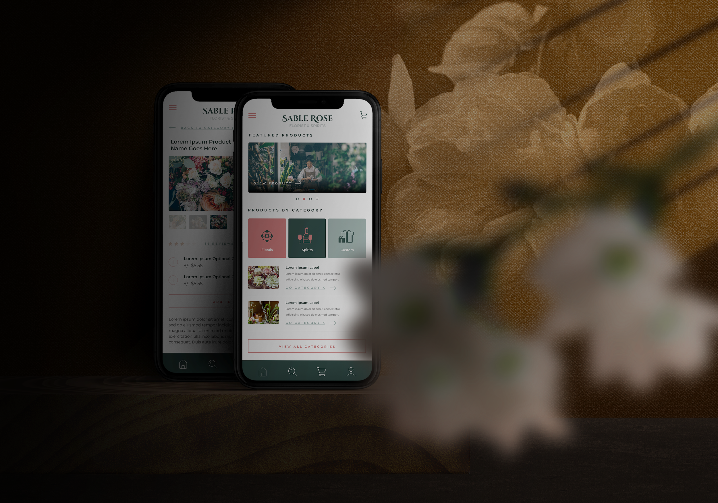
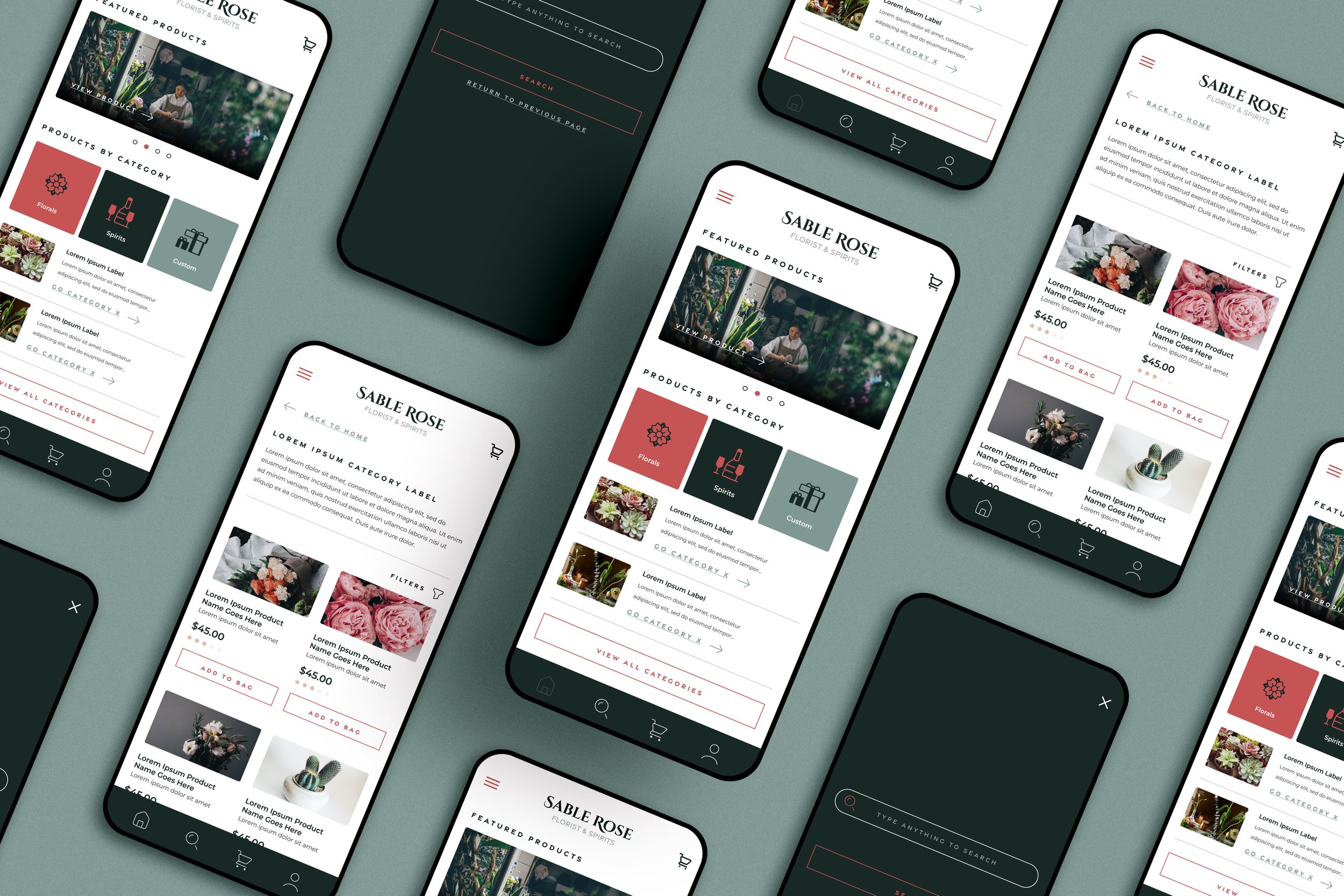
Hi-fidelty Design
Taking feedback from the usability study, the wireframes were modified to include: category format was adjusted to show quick access to high-level categories, CTA tags were added in the category listings to show they are categories and not products, language has been added to the category listings to indicate where link will lead them.
The high-fidelity prototype extends the app experience from the lo-fi version buy adding a couple more pages that ends the user journey at the order confirmation page.
Conclusion
Accessibility Considerations
Although some screens don’t show the full functionality that is planned for the app, a number of considerations were taken to make the app more accessible to people with communication, physical, visual, and auditory difficulties.
Limitations and Next Steps
Users were vocal about their appreciation for how convenience the ordering process was. The next steps would be to conduct another round of usability studies that focus on other app functionality (order tracking, account features, etc). In addition, conduct user research on new areas of need.
What I learned
Designer biases are easier to overlook. One should not assume user will know common gestures and buttons so clear CTA’s and language is integral to a worthwhile user experience.
