
MULTI-MEDIA
Kaiju Defense Force
An exploration and celebration of strange beasts, Kaiju Defense Forceis a multi-faceted creative project that features visual art, short stories,with more mediums/outlets to come.This zine is our first collection of allcreatures from Toho to Pacific Rim.Whether you aim to destroy all monsters or befriend them, we hope youfind something to sink your teeth into.
Download Issue 1, Here


ROLE/RESPONIBILITIES
As the creator of the zine/project I coordinated with artists, provided my own art, designed the logo, co-edited the zine, designed the layout, coordinated the printing, and marketed the project.
GOALS/OBJECTIVE
To create a multi-media project (starting with printed publications) centered around old-school monster movies from a Japanese film genre called “Tokusatsu”. The zine celebrates movies ranging from Godzilla to b horror like The Tire.

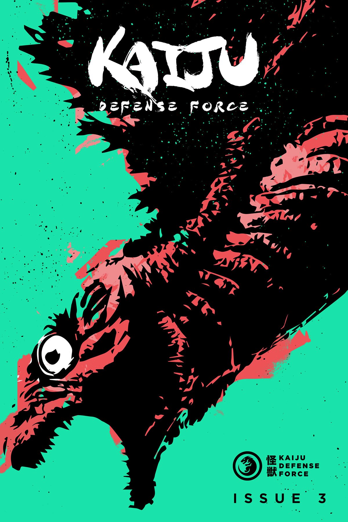
Logo System
The logo for the Kaiju Defense Force Zine embodies the spirit and purpose of the publication. The main logo, positioned on the left, showcases a minimal and bold depiction of a Godzilla-like monster. This choice emphasizes the power and impact of kaiju, symbolizing the awe-inspiring creatures that the zine explores. The monster's commanding stance exudes dominance and strength, while the lockup with bold text evokes an army's badge or call sign, reinforcing the idea of a unified force. This logo unifies Godzilla enthusiasts, fostering a sense of belonging and camaraderie within the Kaiju Defense Force community.
The top-right word mark, designed with a brush stroke-like font, pays homage to Japanese calligraphy and the cultural heritage of Godzilla. This choice infuses the zine with artistic flair and dynamism, capturing the passion and energy of the kaiju fandom. As for the final logo, adapted specifically for t-shirt designs, it retains the main logo's elements. By utilizing the main logo for apparel, the zine highlights its commitment to understanding and appreciating kaiju, as "kaiju" translates to "strange beasts." This logo serves as a reminder of the fascinating and diverse creatures explored within the pages of the zine, intriguing fans with their mysterious and awe-inspiring nature.


