VISUAL BRAND DEVELOPMENT
Boba Bar Co.
Founded in Chicago, IL by Jeri Quinones, Allen Germino, and Minh Ta, Boba Bar Co. serves Chicago-land the classic bubble tea drink with a modern twist in design. This was our original brand concept, but the group is pivoting towards a new design approach.
ROLE/RESPONIBILITIES
My role was partnering with the owners and developing the logo and visual brand execution.
GOALS/OBJECTIVE
Design a new logo that is bold and recognizable and a visual brand language that evokes as sense of freshness.


Brand and Logo
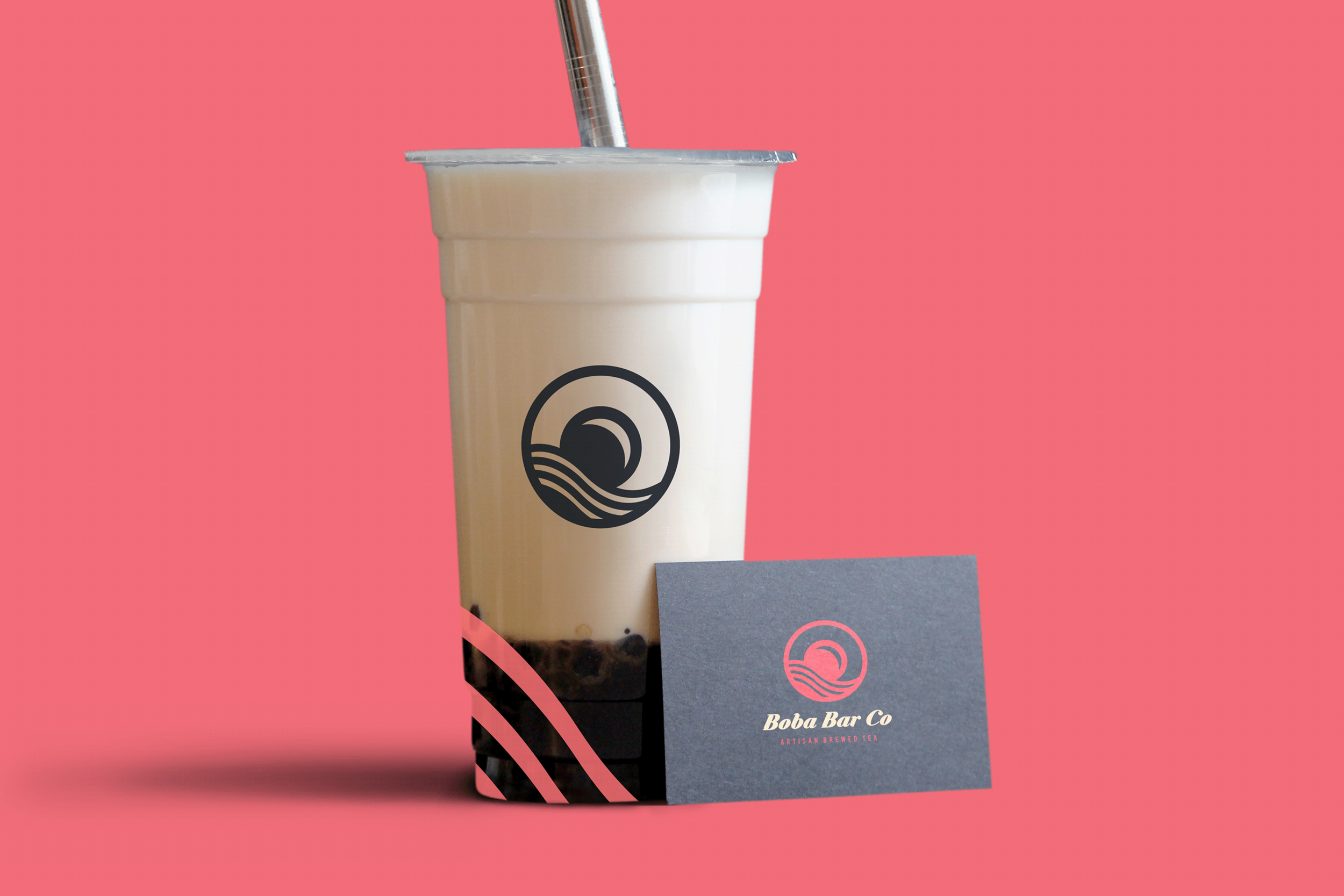
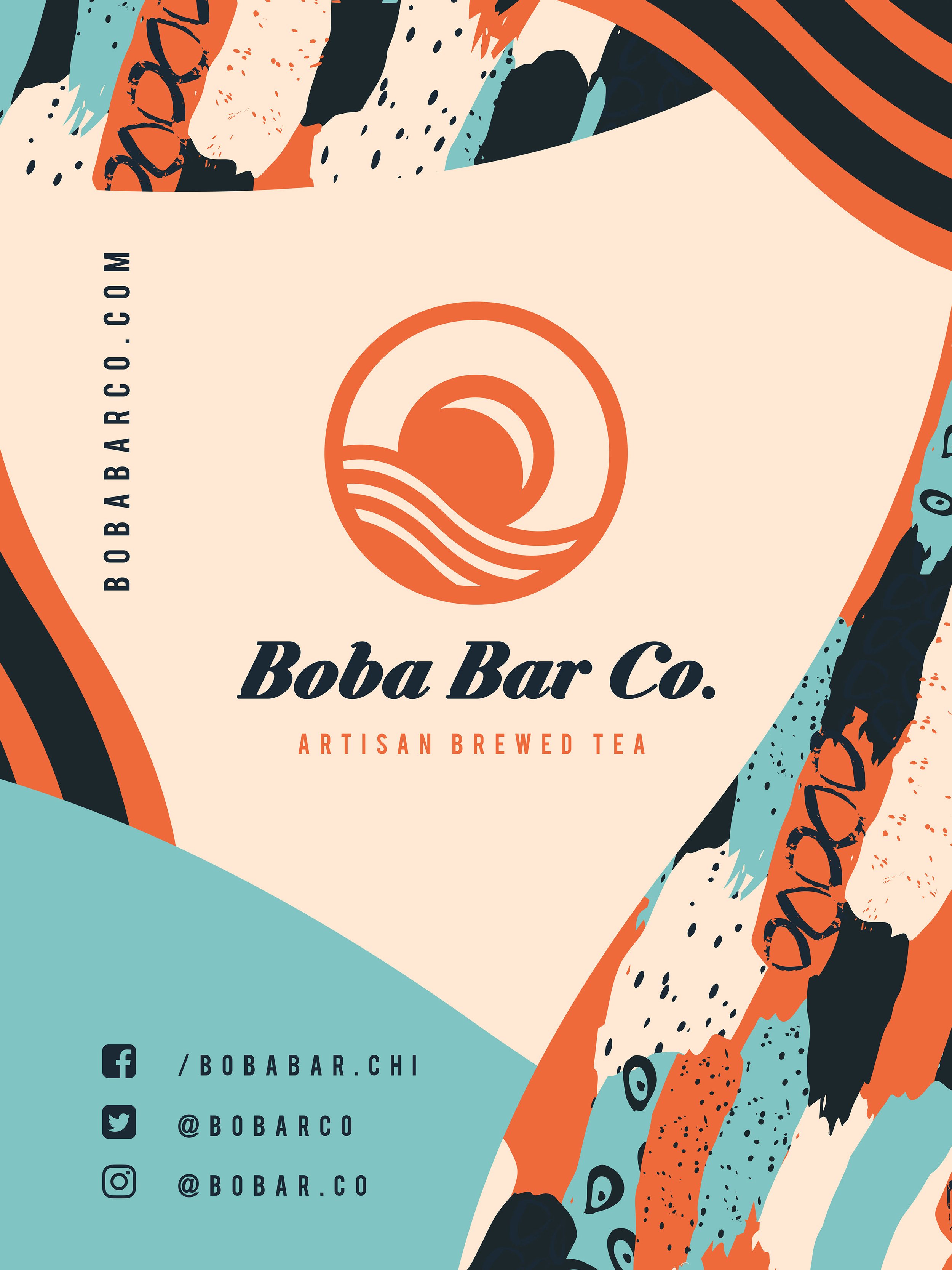
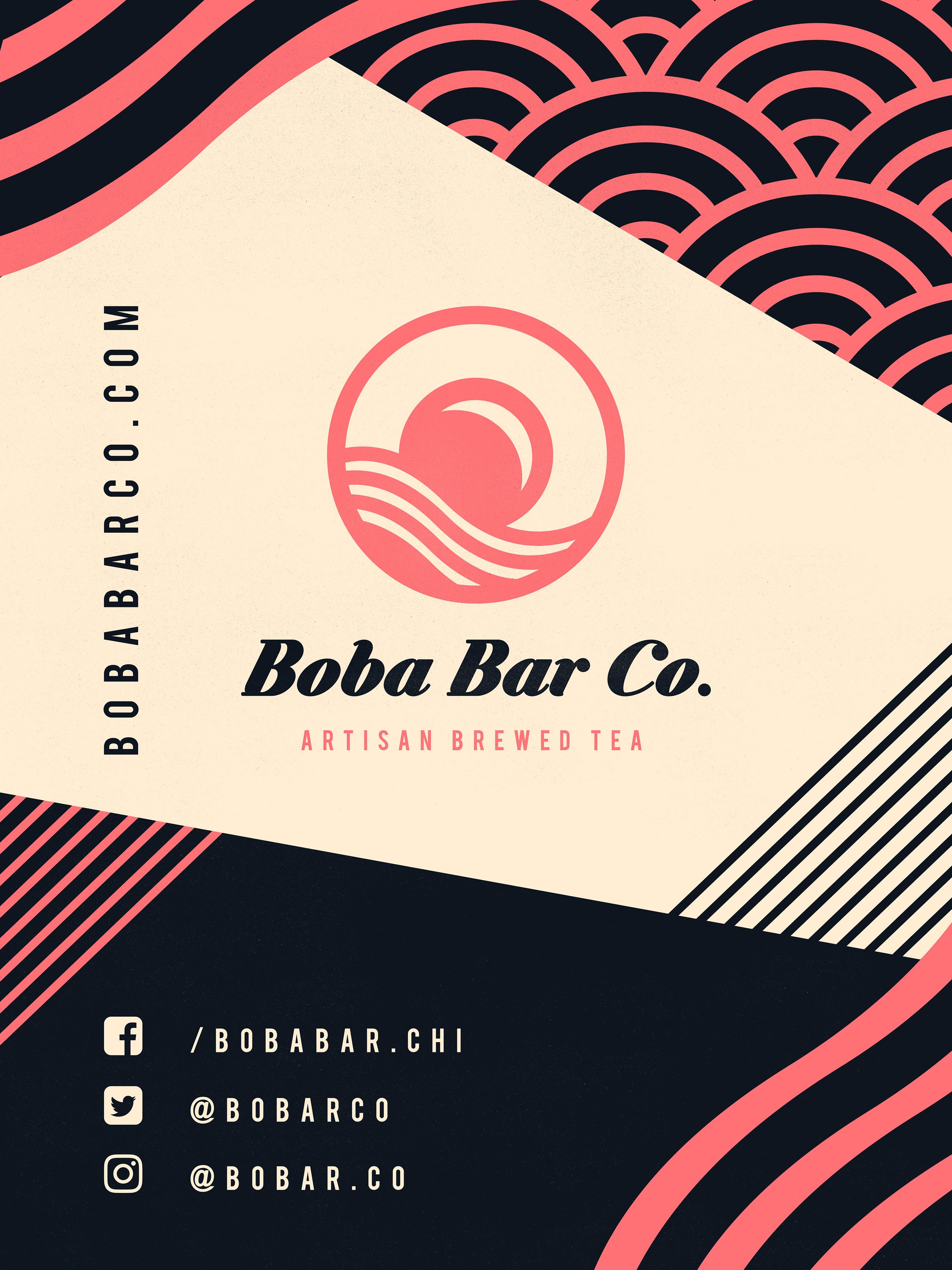
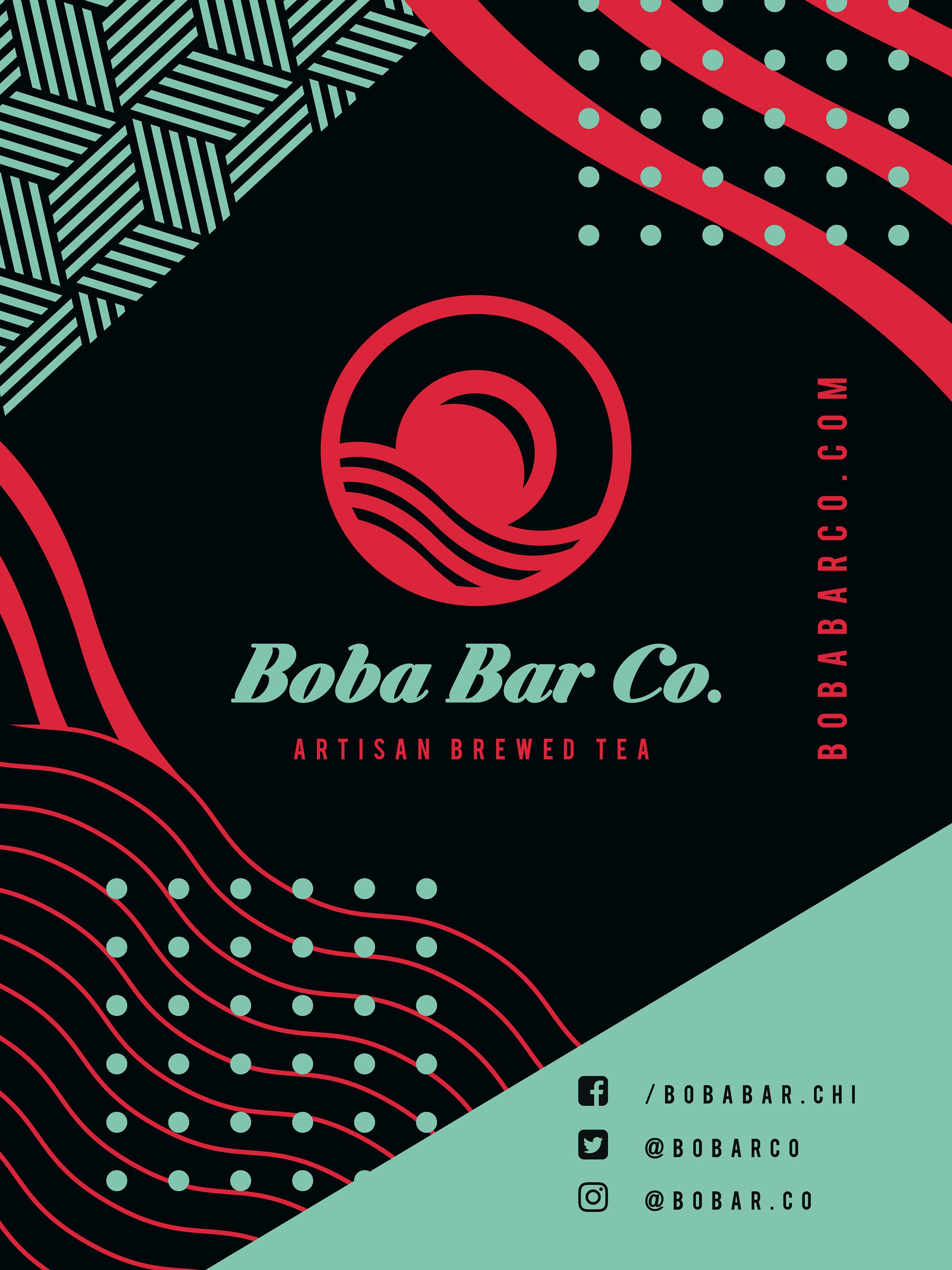
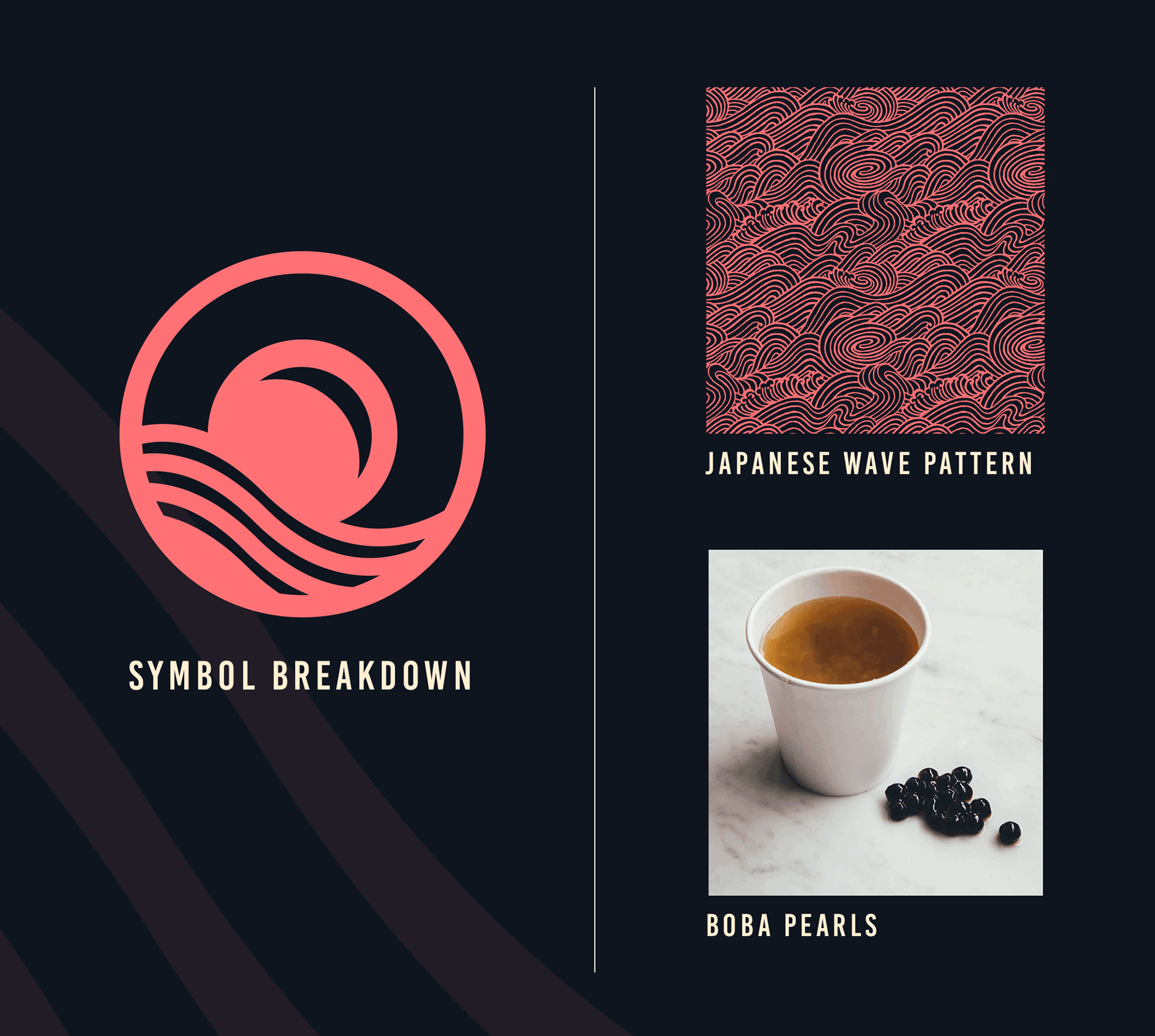
The logo for Boba Bar Co combines the iconic elements of a tapioca pearl and a Japanese wave pattern to create a visually captivating representation of the brand. The carefully crafted depiction of the tapioca pearl instantly connects to the signature ingredient used in boba tea, establishing a strong visual association with the brand's core product. Accompanying this is a subtle Japanese wave pattern, symbolizing movement and tranquility, reflecting the vibrant and dynamic atmosphere of Boba Bar Co. The wordmark, designed with a bold serif typeface, strikes a balance between elegance and playfulness. The rounded edges of the letters add a touch of approachability, while the boldness exudes confidence. Overall, the logo beautifully captures the essence of Boba Bar Co, showcasing its unique fusion of flavors, cultural influences, and inviting customers to indulge in a delightful boba tea experience.
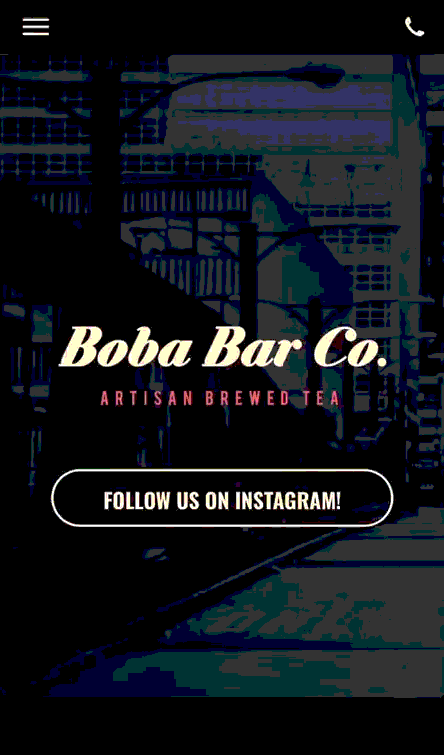
Website
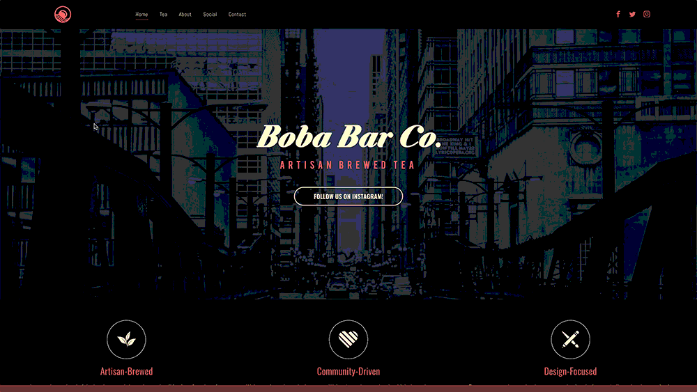
The website was a minimalist, yet impactful splash page created using Wix. The site serves as a representation of the brand's distinct color palette and design philosophy, while primarily functioning as an informative hub. The brand primarily utilized social media platforms for outreach and communication, leading to the decision to discontinue the website. However, this portfolio provides a glimpse into the original design and concept, capturing the essence of the brand's vision and aesthetic.
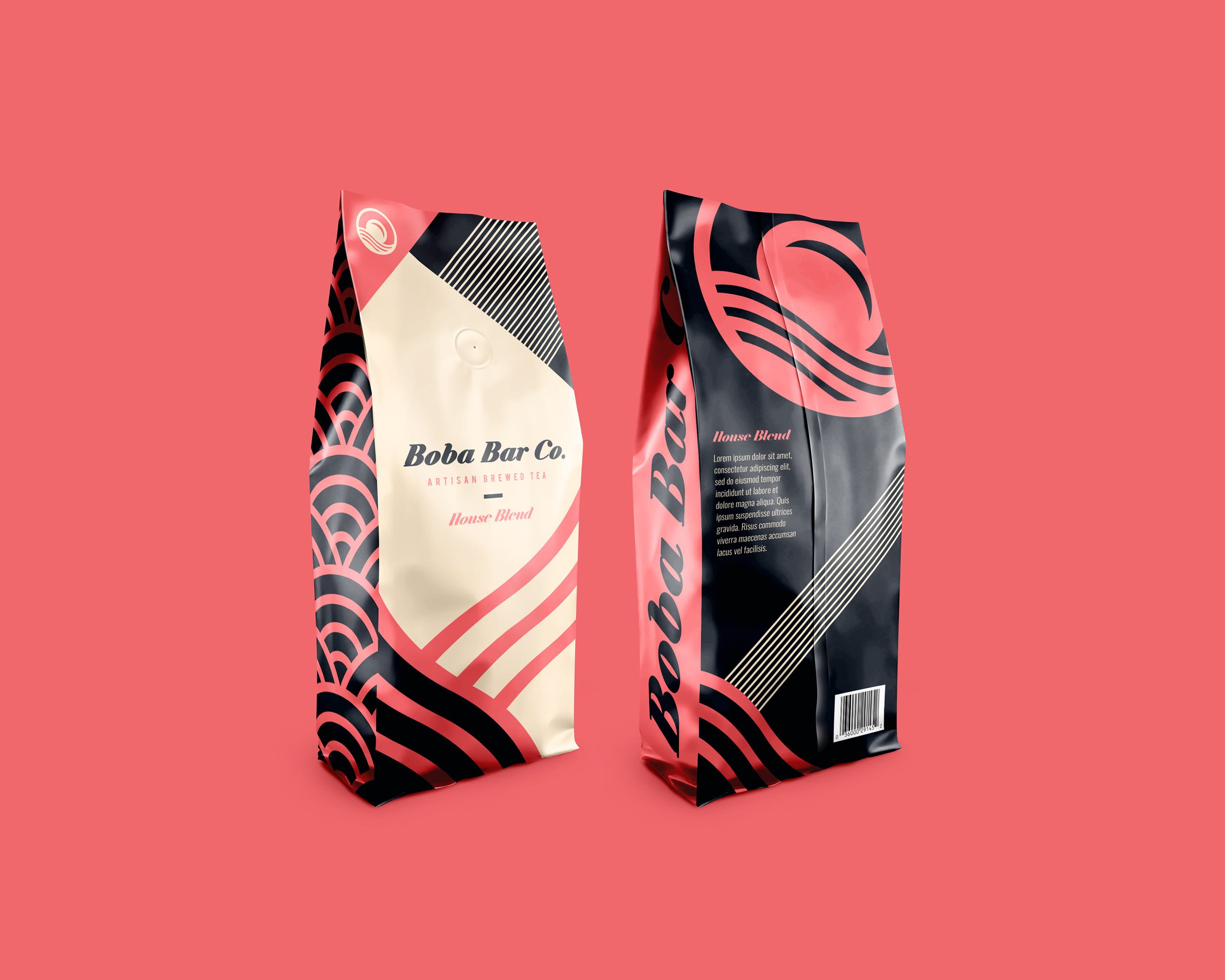


Packaging
The packaging of our boba tea leaves embodies a captivating fusion of elements inspired by our logo. The design creates an immersive visual experience. Expressive patterns inspired by the waves add movement and energy to the packaging, reflecting the vibrant and dynamic nature of the brand. These patterns are carefully integrated, enhancing the overall aesthetic appeal while evoking a sense of playfulness and cultural fusion. With its elegant yet lively design.